Academic Project

2026

Redesigning Sadako's digital dining experience

Improving how customers explore the menu and navigate a local restaurant's website.
Role

Design

Timeline

01/2026 - 03/2026

Tools

Figma, FigJam, Loveable, Vercel

Team

2 Designers

Role

Design

Timeline

01/2026 - 03/2026

Platform

Mobile App

Team

2 Designers

Overview

Making restaurant browsing simpler and more intuitive

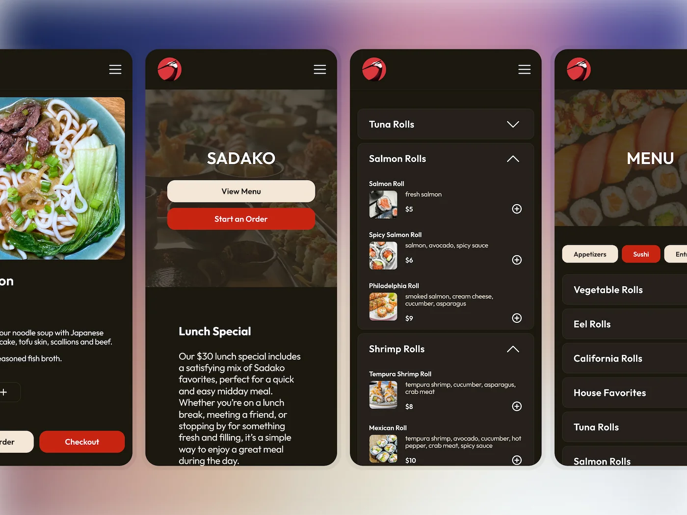
Sadako is a local Japanese restaurant in Ann Arbor that our team knows and loves. Its mobile website serves as an important touchpoint for customers looking to explore the menu and dining options on the go. With this redesign, we wanted to improve the mobile websiteโ€™s navigation, visual hierarchy, and menu-browsing experience while preserving the charm that makes Sadako special.

Research

Understanding Sadako's place in the competitive landscape

We analyzed competing Japanese and Asian restaurants in Ann Arbor to better understand what sets Sadako apart. Our findings confirmed what we already loved about Sadako:

It occupies a uniquely distinct position in the local dining landscape, offering a traditional, casual, and approachable dining experience.

Traditional
Trendy
Elevated
Casual
Traditional & Elevated
Trendy & Elevated
Traditional & Casual
Trendy & Casual
Sadako
Totoro
Umi Sushi
Tabe
Slurping Turtle
Mama Satto
Nagomi
KANBU
Plate Sushi & Chicken
Momo

Website Audit

Taking a closer look at Sadako's existing website

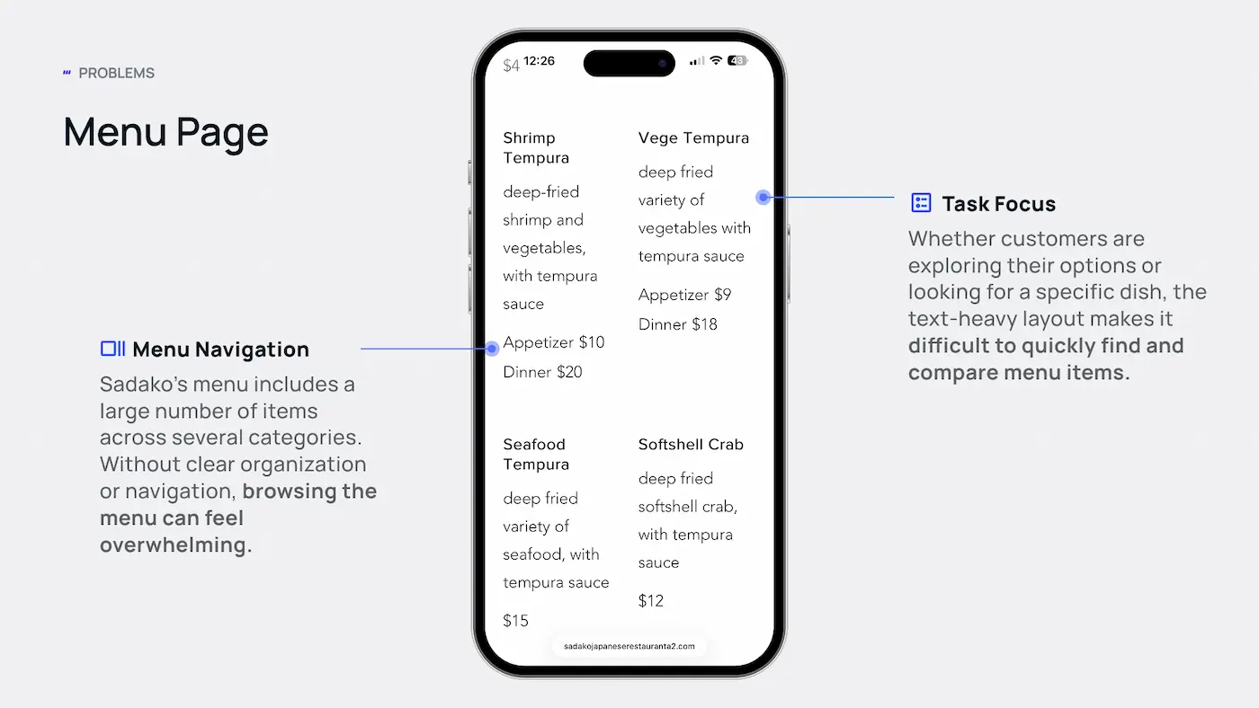
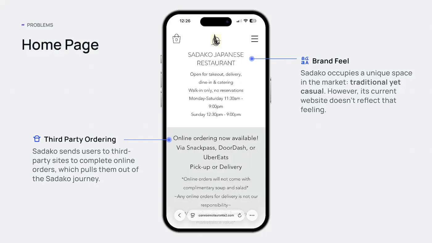
While we love Sadako's food and welcoming atmosphere, we noticed that its website didn't quite capture the same experience. We took a closer look at the existing site to identify opportunities to improve usability while better reflecting what makes Sadako special.

Home Page
Menu Page

Design Opportunities

Brand Identity

Create a visual experience that captures Sadako's traditional yet casual atmosphere, balancing comfort with quality.

Ordering Experience

Create a smoother transition from browsing to ordering by making ordering options clear and easy to access.

Menu Browsing

Organize Sadako's extensive menu to make it easier for customers to explore, find, and compare dishes without feeling overwhelmed.

Design Opportunities

Brand Identity

Create a visual experience that captures Sadako's traditional yet casual atmosphere, balancing comfort with quality.

Ordering Experience

Create a smoother transition from browsing to ordering by making ordering options clear and easy to access.

Menu Browsing

Organize Sadako's extensive menu to make it easier for customers to explore, find, and compare dishes without feeling overwhelmed.

Design Opportunities

Brand Identity

Create a visual experience that captures Sadako's traditional yet casual atmosphere, balancing comfort with quality.

Ordering Experience

Create a smoother transition from browsing to ordering by making ordering options clear and easy to access.

Menu Browsing

Organize Sadako's extensive menu to make it easier for customers to explore, find, and compare dishes without feeling overwhelmed.

Menu Page

Design Process

Finding inspiration in the bento box

Our team explored various restaurant websites for inspiration, but one idea in particular caught our attention: the Japanese bento box.

We loved how a bento box organizes different dishes into their own compartments while bringing everything together as one cohesive experience. This inspired us to bring that same sense of structure and balance to Sadako's website.
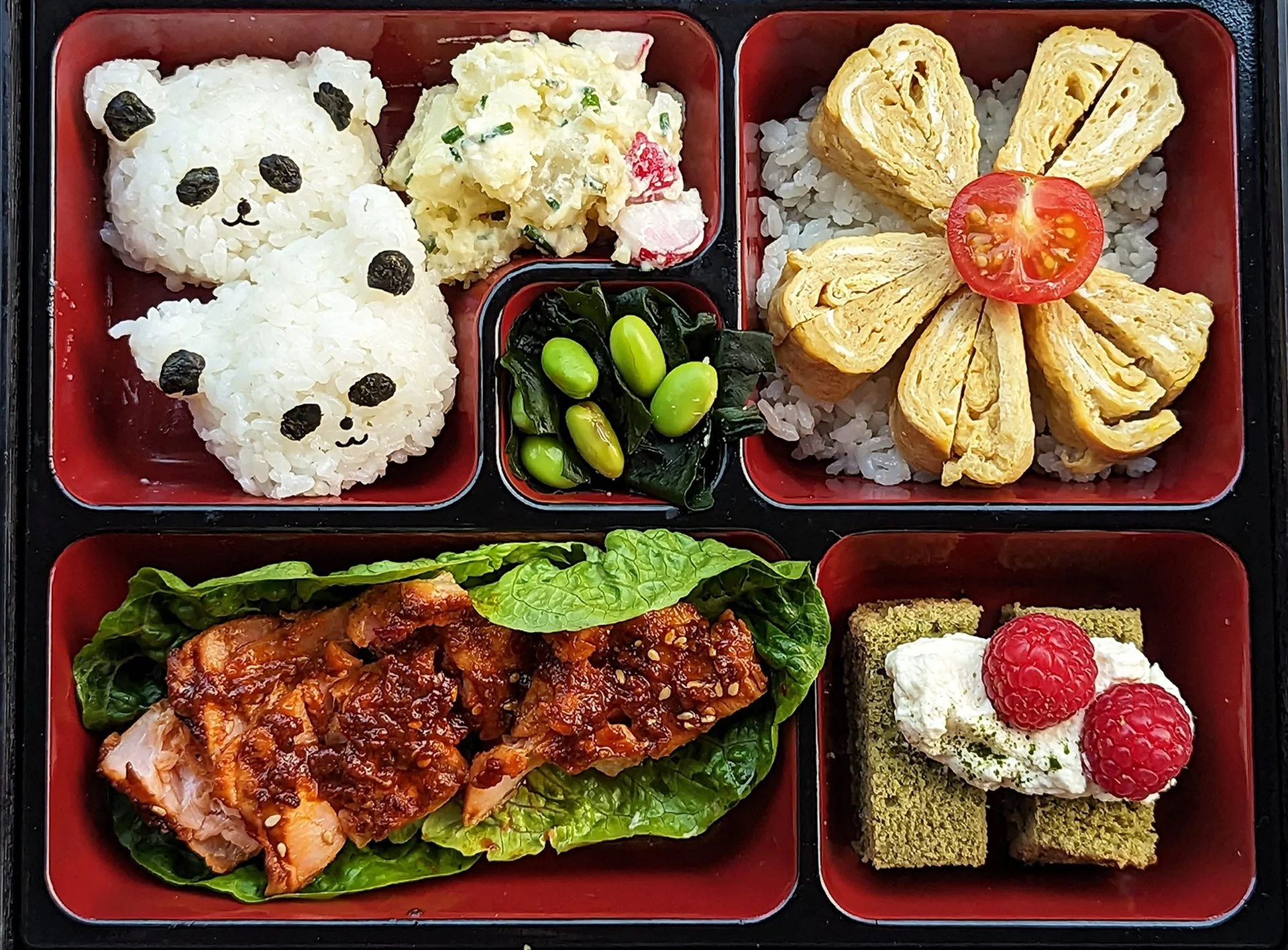
Bento box inspiration โ€” organization through distinct, balanced compartments.

Wireframing

Turning inspiration into structure

With the bento box concept in mind, we began exploring different layouts for Sadako's website. We focused on organizing content into clear, distinct sections that would make the menu easier to browse while creating a more balanced and intuitive experience.

We also used AI to quickly prototype and explore different layout ideas, helping us visualize potential directions before refining our designs.

Home Page

Menu Page

Style Guide

Bringing Sadako's personality into the design

After exploring different layouts, we turned our attention to Sadako's visual identity. We experimented with colors, typography, and imagery to create a look that felt fresh and modern while still reflecting the restaurant's traditional, casual charm.

Typography

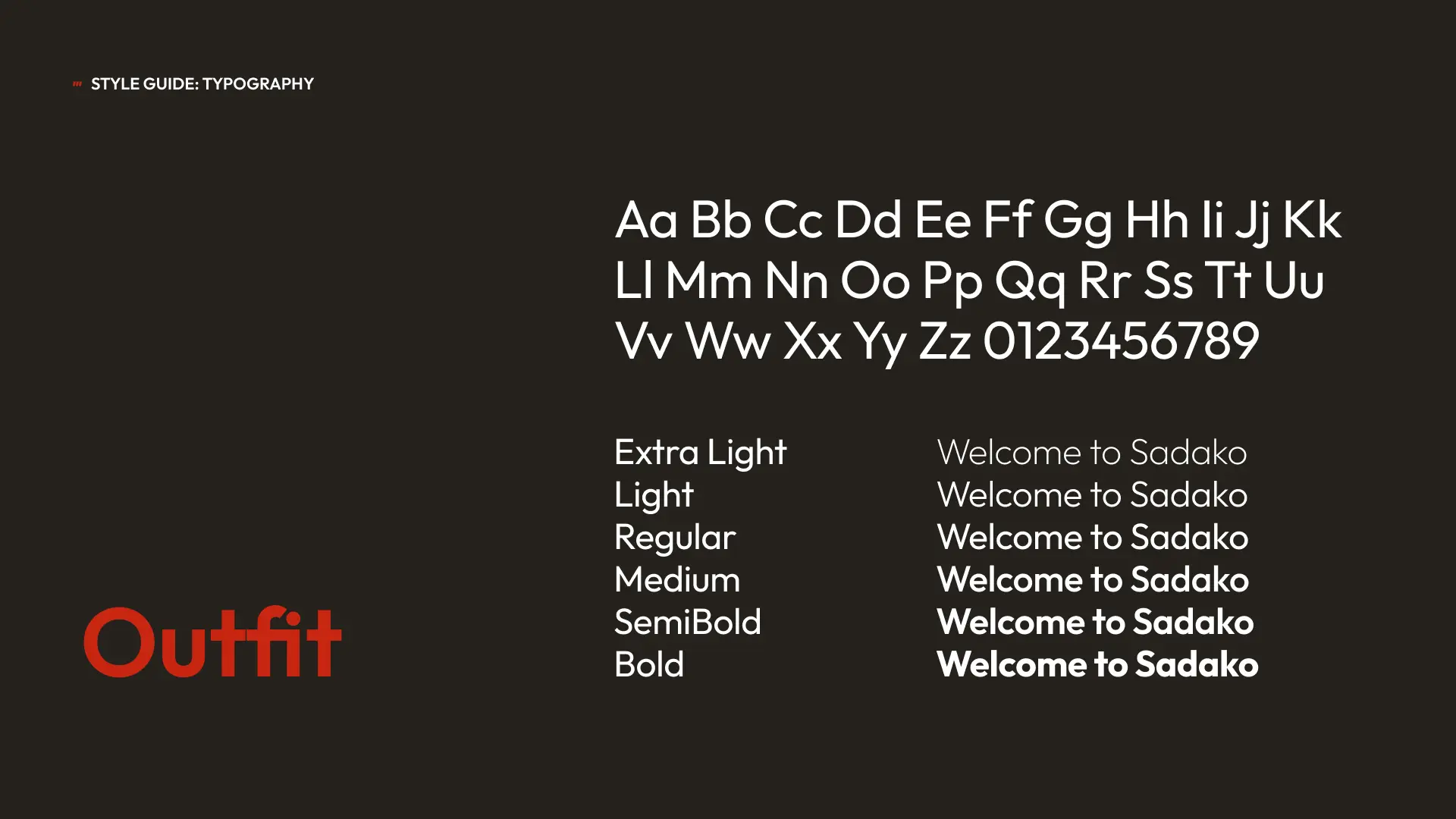
We chose Outfit for its clean, minimalist style, using one typeface to reduce visual noise and create a cohesive experience inspired by the simplicity of Japanese design.

Brand Colors

Components
Solution

Bringing Sadako's digital experience to life

Bringing together our research, bento box inspiration, and visual design choices, we redesigned Sadako's website to better reflect its traditional yet casual charm while making the experience more intuitive across devices.

Mobile Design

Mobile Design

Making Sadako easier to explore on mobile

We focused on improving the mobile experience by making the menu easier to navigate, ordering options more accessible, and Sadako's personality more visible throughout the website.

We focused on improving the mobile experience by making the menu easier to navigate, ordering options more accessible, and Sadakoโ€™s personality more visible throughout the website.

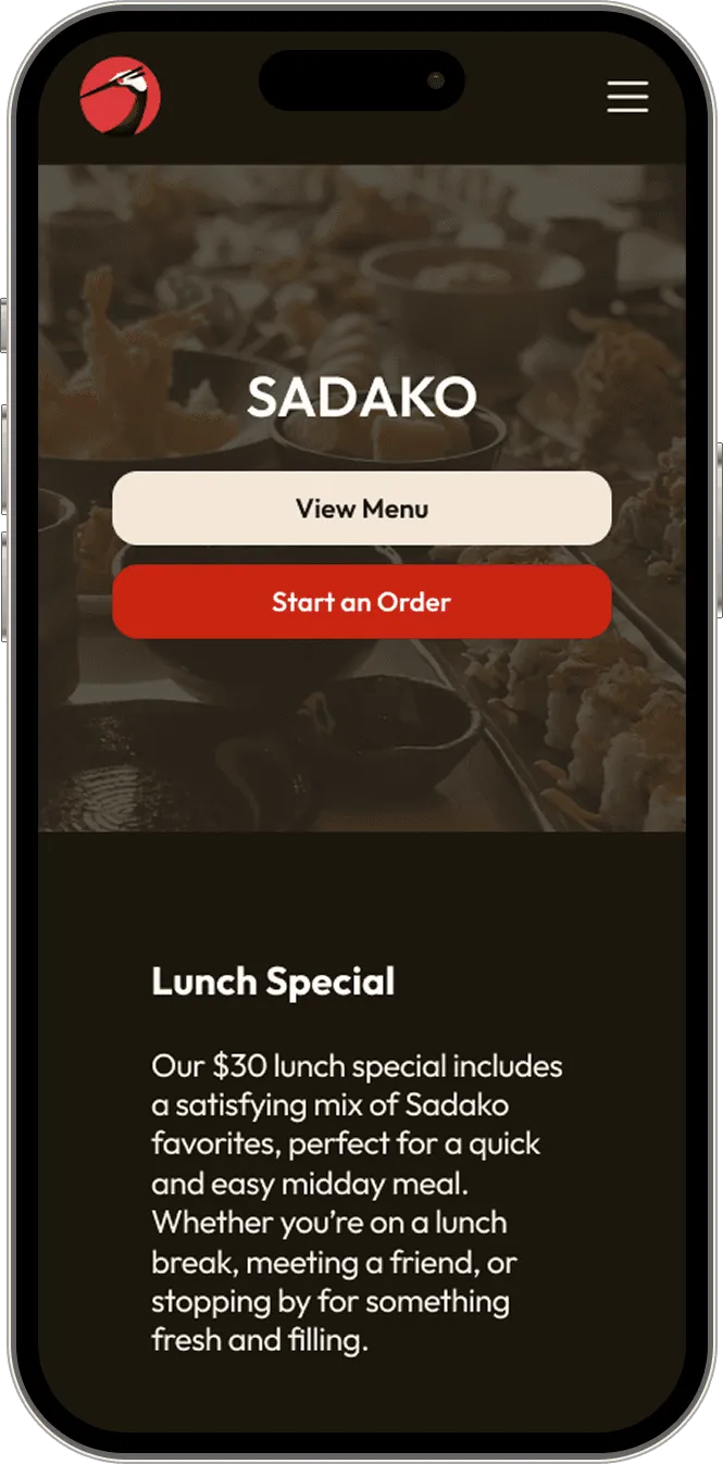
Home Page

Home Page

Menu Page

Menu Page

Menu Categories Page

Menu Categories Page

Item Page

Item Page

01 โ€” MOBILE NAVIGATION

01 โ€” MOBILE NAVIGATION

Making Sadako's extensive menu easier to explore

Making Sadako's extensive menu easier to explore

We redesigned the mobile menu with horizontally scrollable categories and expandable sections, helping customers explore Sadako's extensive selection without feeling overwhelmed.

We redesigned the mobile menu with horizontally scrollable categories and expandable sections, helping customers explore Sadakoโ€™s extensive selection without feeling overwhelmed.

Audit Finding

Audit Finding

Audit Finding

Sadako's original menu displayed a large number of dishes in a dense, text-heavy layout, making it difficult to quickly find and compare items.

Sadakoโ€™s original menu displayed a large number of dishes in a dense, text-heavy layout, making it difficult to quickly find and compare items.

Menu Page

Menu Page

Menu Page

Menu Categories

Menu Categories

Design Response

Design Response

We organized the menu into clear, scrollable categories and collapsible sections, allowing customers to browse at their own pace while keeping dish details and add-to-cart actions easily accessible.

We organized the menu into clear, scrollable categories and collapsible sections, allowing customers to browse at their own pace while keeping dish details and add-to-cart actions easily accessible.

02 โ€” TASK FOCUSED VS. EXPLORATORY BROWSING

02 โ€” TASK FOCUSED VS. EXPLORATORY BROWSING

Supporting different ways of exploring the menu

Supporting different ways of exploring the menu

Supporting different ways of exploring the menu

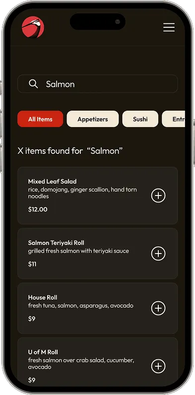
Not everyone approaches a menu the same way. Some customers know exactly what they want, while others prefer to browse and discover new dishes. We designed the menu to support both experiences.

Not everyone approaches a menu the same way. Some customers know exactly what they want, while others prefer to browse and discover new dishes. We designed the menu to support both experiences.

Audit Finding

Audit Finding

Audit Finding

The original menu's dense, text-heavy layout made it difficult for customers to quickly locate specific dishes or comfortably explore their options.

The original menuโ€™s dense, text-heavy layout made it difficult for customers to quickly locate specific dishes or comfortably explore their options.

Menu Page

Task Focused Search

Task Focused Search

Exploratory Browsing

Exploratory Browsing

Design Response

Design Response

We kept search results simple and text-focused to help customers find specific dishes quickly, while incorporating food imagery into the browsing experience to make exploring the menu more inviting.

We kept search results simple and text-focused to help customers find specific dishes quickly, while incorporating food imagery into the browsing experience to make exploring the menu more inviting.

03 โ€” BENTO-INSPIRED DESIGN

03 โ€” BENTO-INSPIRED DESIGN

Bringing structure and personality together

Bringing structure and personality together

Inspired by the Japanese bento box, we used modular layouts to organize content into distinct sections while reflecting Sadakoโ€™s warm, casual atmosphere.

Inspired by the Japanese bento box, we used modular layouts to organize content into distinct sections while reflecting Sadakoโ€™s warm, casual atmosphere.

Audit Finding

Audit Finding

Audit Finding

Sadakoโ€™s original website lacked a cohesive visual identity, making it difficult to convey the restaurantโ€™s character.

Sadakoโ€™s original website lacked a cohesive visual identity, making it difficult to convey the restaurantโ€™s character.

Modular Sections

Modular Sections

Menu Page

Visual Storytelling

Visual Storytelling

Design Response

Design Response

We used distinct content sections to balance restaurant imagery, menu information, and clear calls to action, creating a cohesive experience that reflects Sadakoโ€™s warm, casual identity.

We used distinct content sections to balance restaurant imagery, menu information, and clear calls to action, creating a cohesive experience that reflects Sadakoโ€™s warm, casual identity.

Learnings

Taking these lessons forward

Balancing aesthetics with functionality

We learned to balance visual storytelling with practical usability, ensuring that food photography and branding enhanced the experience without distracting from navigation and ordering.

Balancing aesthetics with functionality

We learned to balance visual storytelling with practical usability, ensuring that food photography and branding enhanced the experience without distracting from navigation and ordering.

Designing for different user intentions

Customers may want to explore the menu or find a specific dish quickly. Designing for both behaviors helped us create a more flexible and intuitive browsing experience.

Designing for different user intentions

Customers may want to explore the menu or find a specific dish quickly. Designing for both behaviors helped us create a more flexible and intuitive browsing experience.

Finding inspiration beyond digital interfaces

Drawing inspiration from the Japanese bento box showed us how familiar physical structures can inform digital layouts, creating a cohesive design concept that supports both organization and brand identity.

Finding inspiration beyond digital interfaces

Drawing inspiration from the Japanese bento box showed us how familiar physical structures can inform digital layouts, creating a cohesive design concept that supports both organization and brand identity.